There are lots of new additions and nifty enhancements to discover on this new version of poetryschool.com.
Here’s a rundown of what’s new and why:
1) AUTOMATIC ENROLMENT
Book onto any course or workshop – online or face to face – and immediately access your course group on CAMPUS
Automatic enrolment means you can get into your course group without going through our previous somewhat sluggish group request system. This is fantastic news for everyone – students don’t have to wait, and Poetry School staff free up a lot of administrative time.
Like before, ‘Courses’ will essentially work like Private groups on CAMPUS. You’ll access them either through your personal account via the ‘Quickdash’ dashboard (see below), or via your Activity stream, or by going through the Groups Directory on CAMPUS. There will still be a group request tool for all Private Groups so they don’t become a free-for-all.
If you want to find your course quickly, then go to the Quickdash….
2) QUICKDASH
Your new Dashboard
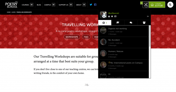
The Quickdash is your new Dashboard. It’s a very quick-n-easy portal to everything you need on the site.
Click on your avatar icon (top right of the screen) to expand the Quickdash menu. From there, you can easily access your latest CAMPUS Notifications, Private Messages, Courses, Groups and Friends. You can also edit your profile information, change your account settings and check your billing information.
3) A MORE MOBILE-FRIENDLY WEBSITE
Browse courses, make payments, read blog posts and check into CAMPUS from the ease of your phone or tablet
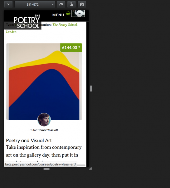
The old sites – poetryschool.com and CAMPUS – were not on hand-holding terms with the handheld. We’ve changed that. Now, anything you can do via a laptop should now be as easy to access as via your smartphones and tablets – even online courses and live chats.
It has required some nifty design work to create a site that displays as responsively on mobile devices as on laptops and monitors. Getting a good balance across so many different devices and screen sizes is a difficult job, but we’ve made huge improvements on what we had before.
4) NEW CAMPUS DISPLAY
Goodbye ‘tile’ display, hello ‘timeline’
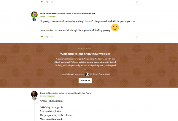
The ‘tile’ look was probably the most controversial part of the old CAMPUS site. Half of you liked it, and half hated it. For the new look site, we have opted for function over form and dumped the tiling. The new layout is simpler and clearer, and will make searching and content discovery much easier.
Nice knowing you, tiles!
5) SPEEDIER LOAD TIMES
Bigger server = faster page loads and response times
This is particularly good news for anyone who does live chats on CAMPUS. We’ve invested in more server power for a much smoother, speedier experience.
6) EDIT YOUR OWN MESSAGES
Made a mstake mistake on CAMPUS? Don’t worry – you can now go back and edit your original message whenever you want
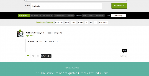
Previously, CAMPUS was a case of ‘publish and be damned’. If you wanted to correct a post, you had to delete it and post a new message. Now, just click on the edit button (the little pen icon) and change your message. Easy peasy.
7) HASHTAGS
Add hashtags and metadata to CAMPUS posts; explore trending topics

If you’ve ever used Twitter, you’ll be familiar with hashtags. It’s a great way to search for posts that have a common topic or a specific group activity associated with them, like #NationalPoetryDay or #derangedpoetess.
Hashtags are just another way of categorising your posts, but they can work across the whole site. Click on any hashtag to see all the other posts using the same tag.
There is also Trending section for you to browse trending topics and the most commonly used hashtags (great for breaking news or seasonal events), or you can try creating your own completely new tag and see if it catches on.
8) ‘ADD MEDIA’ TOOL
A new way to upload photos and documents
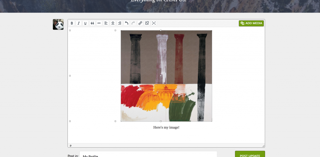
If you want to upload a photo or document in CAMPUS, you now just click on ADD MEDIA.
As for links and video – well, that we’ve made a darn lot simpler. Simply paste a link in, and CAMPUS will embed the video or article direct into your post automatically.
We’ve had to dump a key part of the old site that unfortunately doesn’t work anymore – Documents. This was done reluctantly, as we rather liked the way Documents worked before, but unfortunately the world of technology isn’t as standardised and heavily regulated as, say, the construction industry. These infuriating things occur from time to time, such is the lot of any web project.
As a solution to this issue, the ‘Documents’ tab has now essentially been replaced by tags, which will require a little bit of user effort to work properly. If you want to search for all documents in any group, search for #docs. And if you’re adding a document, go to ADD MEDIA and upload the file/s you want, and remember to add #docs to your post, or no-one else will be able to find it. For online courses, there will be a simple tag naming convention for various keys files (e.g., #poems, #transcripts, #assignments). A little bit more effort, but also a lot more customisation and power.
So to re-cap: you’ll still be able to add text file documents of any kind, using the hashtag system described above (e.g., clicking on the ‘Documents’ tab in your group, or clicking on the #docs hashtag will bring up every post tagged ‘#docs’). We’ll explain this a bit more in the CAMPUS user guide.)
It’s not as complicated as it sounds, I swear!
9) ENHANCED PROFILE CUSTOMISATION & FUNCTIONALITY
Bigger profiles with full integration across the whole site
CAMPUS grew over its first two years into a beehive of activity, but it craved more personalisation and opportunities for users to express their individuality.
So we’ve done two new things.
We’ve added more customisation to your profile page. As well as the essentials (your username, your Twitter, a bit of personal background) you can now also add links to some of your published work online (Portfolio), spoken languages, country of origin, a list of published works, and more. Not only will this increase trust in the site and give more substance to its inhabitants, but also its usefulness: CAMPUS is increasingly used a professional resource, and as far as I’m aware there isn’t a LinkedIn style database for active writing poets in the UK, so this could well become it.
We’ve also melded our CAMPUS and Poetry School databases, so now you use one account for everything. From the new Quickdash dashboard, you’ll can edit your profile, check notifications and messages, view your course groups, check billing information, and book new courses.
10) BETTER SEARCH
Search for pages, courses, tutors, groups, blog posts – and even FAQs – across the whole site
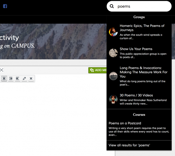
Now we have a powerful global search function: click on the magnifying glass at the top right of the screen, and then filter further on the search results page, and search most of what you’d want to know, including even commonly asked questions.
Due to the technical difficulties involved, our global search does not search through CAMPUS posts, unfortunately. We are not gods.
11) BETTER TYPOGRAPHY
Type by the book

We want people to read and experience as much of poetry as possible. And on our website we are lucky enough to have published hundreds of fantastic poems produced on our courses and workshops by our many extremely talented poets.
If we want to people to read more poetry, we have to find a typeface that looks the part. On our new site we use Fanwood, a smart, back-to-basics type based on Fairfield, the typeface first published in 1940 and designed by Rudolph Ruzicka. This version of Fanwood is web-optimised for increased readability on tablets, laptops and e-book reader hardware. We’ve also put in clean, white background for a higher contrast, which means the site should be easier to read for those with visual impairment, on low quality monitors, in bad lighting conditions, and for small screen users.
We also wanted to strike a particular emotional register. Poets are bookish people and it was important to evoke memories of and associations with print; in this respect, the traditional, letterpress-style script of Fanwood was incredibly suitable
12) POPULAR & FAVOURITE POSTS
Keep track of your best bits; discover other people’s
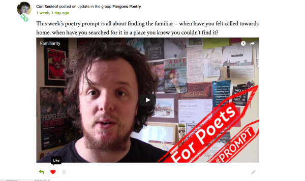
We’ve introduced an improved CAMPUS Favourites tool based on the system used by Tumblr. Simply click on the ‘heart’ icon on any post to have a comment or conversation permanently added to your bookmarks, ready for you to revisit whenever you like by clicking on ‘My Favourites’.
Our biggest innovation is the new Popular tool. Here, ‘popularity’ is ranked according to posts with the most comments and favourites over a certain period of time. Again, this is a quick, easy way to drill down to some of the more active and interesting discussions on CAMPUS that may have been swallowed up by the timeline. This will give conversations much greater longevity on the site, and encourage wider participation.
We have retained all the other ways to locate, discover and remember content: you can search via Global Search according to keywords, or filter according to hashtags, by friend or group.
13) CUSTOMER RELATIONS
Get ready for special deals
We not only do we have a shiny new front-end, but much time and money has been spent on a shiny new CMS (Customer Management System).
Back-end development is the crunchy, ‘boring’ side of IT and the most important bit of any web project, the beating heart that makes everything else tick. A new database might not sound like a lot, but it’s going to make a big difference on the business and admin side of things, which in turn is going to benefit our many loyal poets and customers.
We can now create coupons and time-limited special deals, so look forward to some bargain offers.
14) NEW NAVIGATIONAL DESIGN
Everything in its right place
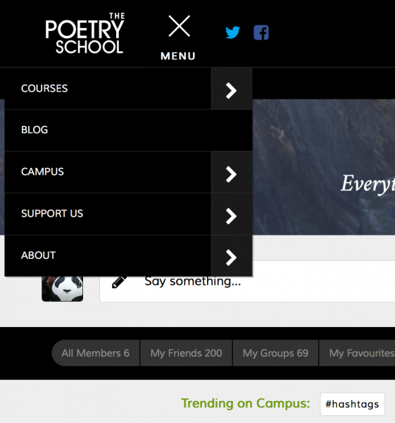
A frequent criticism of our old site and CAMPUS was that it wasn’t intuitive getting around. So we fixed it.
With mobile-orientated design, you’ve not much space in the main nav, so we’ve also added a nice big juicy footer with a more comprehensive pages list of the website. If you’re lost and really feel like you just need a straightforward index, then go there.
15) LUCKY DIP LESSONS
Free downloadable poetry lessons
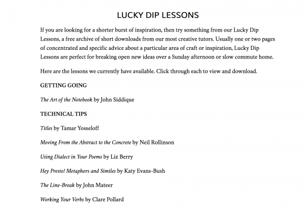
Our entire archive of short downloads are now completely free. That’s right – free poetry courses and lessons, at the click of a button, for nothing. You can find them under ‘Lucky Dip Lessons’ on the Downloads page. Be greedy and download them all – we promise not to judge.
Lucky Dip Lessons are short PDFS, normally one or two pages, of concentrated and specific advice about a particular area of poetic craft or inspiration, with ideas and prompts around a specific theme or topic.
We’ve previously been charging a small fee for these short downloads but they’ve proved so popular with students we thought we’d open source the whole lot as a big THANK YOU to the many talented poets we’ve been fortunate to work with and teach over the years. You’re continued support makes us blush.
Long downloads will remain pay-only to access. We hope to start commissioning new short and long downloads with a revamped look in the not-so-distant future.
!!!!!!!!!!!!!!!!!!!!!!!!!!!!!!!!!!!!!!!!!!!!!!!!!!!!!!!!!!!!!!!!!!!!!!!!!!!!!!!!!!!!!!!!
CONGRATULATIONS YOU’VE MADE IT TO THE END. WE REALLY DON’T DESERVE THAT. HERE’S AN ADORABLE DOG FOR YOUR STRUGGLES
URGENT – Where can I find the CAMPUS user guide please? I am not able to upload my poems to the hashtags in the 2 courses I’m enrolled on this term.
Angela Bailey
Hi Angela,
You can find the Campus Mini Guide here:
https://s3-eu-west-1.amazonaws.com/poetryschool/assets/uploads/2016/05/05181208/CAMPUS-mini-guide1.pdf
nice doggie